11. Likelihood Ratio Processes#
Contents
11.1. Overview#
This lecture describes likelihood ratio processes and some of their uses.
We’ll use a setting described in this lecture.
Among things that we’ll learn are
A peculiar property of likelihood ratio processes
How a likelihood ratio process is a key ingredient in frequentist hypothesis testing
How a receiver operator characteristic curve summarizes information about a false alarm probability and power in frequentist hypothesis testing
How during World War II the United States Navy devised a decision rule that Captain Garret L. Schyler challenged and asked Milton Friedman to justify to him, a topic to be studied in this lecture
Let’s start by importing some Python tools.
import matplotlib.pyplot as plt
plt.rcParams["figure.figsize"] = (11, 5)  #set default figure size
import numpy as np
from numba import vectorize, njit
from math import gamma
from scipy.integrate import quad
11.2. Likelihood Ratio Process#
A nonnegative random variable \(W\) has one of two probability density functions, either \(f\) or \(g\).
Before the beginning of time, nature once and for all decides whether she will draw a sequence of IID draws from either \(f\) or \(g\).
We will sometimes let \(q\) be the density that nature chose once and for all, so that \(q\) is either \(f\) or \(g\), permanently.
Nature knows which density it permanently draws from, but we the observers do not.
We do know both \(f\) and \(g\) but we don’t know which density nature chose.
But we want to know.
To do that, we use observations.
We observe a sequence \(\{w_t\}_{t=1}^T\) of \(T\) IID draws from either \(f\) or \(g\).
We want to use these observations to infer whether nature chose \(f\) or \(g\).
A likelihood ratio process is a useful tool for this task.
To begin, we define key component of a likelihood ratio process, namely, the time \(t\) likelihood ratio as the random variable
We assume that \(f\) and \(g\) both put positive probabilities on the same intervals of possible realizations of the random variable \(W\).
That means that under the \(g\) density, \(\ell (w_t)= \frac{f\left(w_{t}\right)}{g\left(w_{t}\right)}\) is evidently a nonnegative random variable with mean \(1\).
A likelihood ratio process for sequence \(\left\{ w_{t}\right\} _{t=1}^{\infty}\) is defined as
where \(w^t=\{ w_1,\dots,w_t\}\) is a history of observations up to and including time \(t\).
Sometimes for shorthand we’ll write \(L_t = L(w^t)\).
Notice that the likelihood process satisfies the recursion or multiplicative decomposition
The likelihood ratio and its logarithm are key tools for making inferences using a classic frequentist approach due to Neyman and Pearson [NP33].
To help us appreciate how things work, the following Python code evaluates \(f\) and \(g\) as two different beta distributions, then computes and simulates an associated likelihood ratio process by generating a sequence \(w^t\) from one of the two probability distributionss, for example, a sequence of IID draws from \(g\).
# Parameters in the two beta distributions.
F_a, F_b = 1, 1
G_a, G_b = 3, 1.2

@vectorize
def p(x, a, b):
    r = gamma(a + b) / (gamma(a) * gamma(b))
    return r * x** (a-1) * (1 - x) ** (b-1)

# The two density functions.
f = njit(lambda x: p(x, F_a, F_b))
g = njit(lambda x: p(x, G_a, G_b))
@njit
def simulate(a, b, T=50, N=500):
    '''
    Generate N sets of T observations of the likelihood ratio,
    return as N x T matrix.

    '''

    l_arr = np.empty((N, T))

    for i in range(N):

        for j in range(T):
            w = np.random.beta(a, b)
            l_arr[i, j] = f(w) / g(w)

    return l_arr
11.3. Nature Permanently Draws from Density g#
We first simulate the likelihood ratio process when nature permanently draws from \(g\).
l_arr_g = simulate(G_a, G_b)
l_seq_g = np.cumprod(l_arr_g, axis=1)
N, T = l_arr_g.shape

for i in range(N):

    plt.plot(range(T), l_seq_g[i, :], color='b', lw=0.8, alpha=0.5)

plt.ylim([0, 3])
plt.title("$L(w^{t})$ paths");
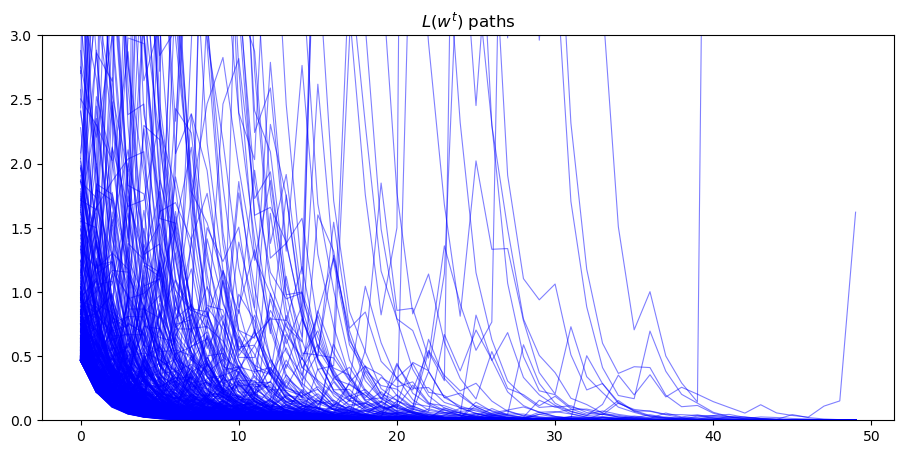
Evidently, as sample length \(T\) grows, most probability mass shifts toward zero
To see it this more clearly clearly, we plot over time the fraction of paths \(L\left(w^{t}\right)\) that fall in the interval \(\left[0, 0.01\right]\).
plt.plot(range(T), np.sum(l_seq_g <= 0.01, axis=0) / N)
[<matplotlib.lines.Line2D at 0x7f2e14276650>]
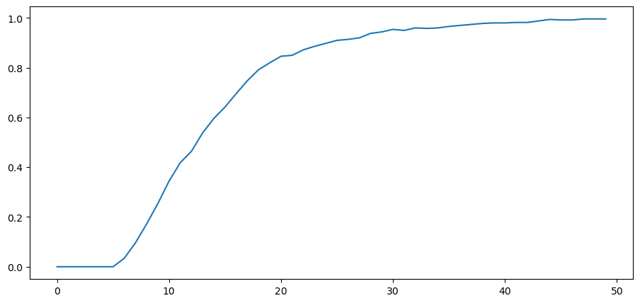
Despite the evident convergence of most probability mass to a very small interval near \(0\), the unconditional mean of \(L\left(w^t\right)\) under probability density \(g\) is identically \(1\) for all \(t\).
To verify this assertion, first notice that as mentioned earlier the unconditional mean \(E\left[\ell \left(w_{t}\right)\bigm|q=g\right]\) is \(1\) for all \(t\):
which immediately implies
Because \(L(w^t) = \ell(w_t) L(w^{t-1})\) and \(\{w_t\}_{t=1}^t\) is an IID sequence, we have
for any \(t \geq 1\).
Mathematical induction implies \(E\left[L\left(w^{t}\right)\bigm|q=g\right]=1\) for all \(t \geq 1\).
11.4. Peculiar Property#
How can \(E\left[L\left(w^{t}\right)\bigm|q=g\right]=1\) possibly be true when most probability mass of the likelihood ratio process is piling up near \(0\) as \(t \rightarrow + \infty\)?
The answer has to be that as \(t \rightarrow + \infty\), the distribution of \(L_t\) becomes more and more fat-tailed: enough mass shifts to larger and larger values of \(L_t\) to make the mean of \(L_t\) continue to be one despite most of the probability mass piling up near \(0\).
To illustrate this peculiar property, we simulate many paths and calculate the unconditional mean of \(L\left(w^t\right)\) by averaging across these many paths at each \(t\).
l_arr_g = simulate(G_a, G_b, N=50000)
l_seq_g = np.cumprod(l_arr_g, axis=1)
It would be useful to use simulations to verify that unconditional means \(E\left[L\left(w^{t}\right)\right]\) equal unity by averaging across sample paths.
But it would be too computer-time-consuming for us to that here simply by applying a standard Monte Carlo simulation approach.
The reason is that the distribution of \(L\left(w^{t}\right)\) is extremely skewed for large values of \(t\).
Because the probability density in the right tail is close to \(0\), it just takes too much computer time to sample enough points from the right tail.
We explain the problem in more detail in this lecture.
There we describe a way to an alternative way to compute the mean of a likelihood ratio by computing the mean of a different random variable by sampling from a different probability distribution.
11.5. Nature Permanently Draws from Density f#
Now suppose that before time \(0\) nature permanently decided to draw repeatedly from density \(f\).
While the mean of the likelihood ratio \(\ell \left(w_{t}\right)\) under density \(g\) is \(1\), its mean under the density \(f\) exceeds one.
To see this, we compute
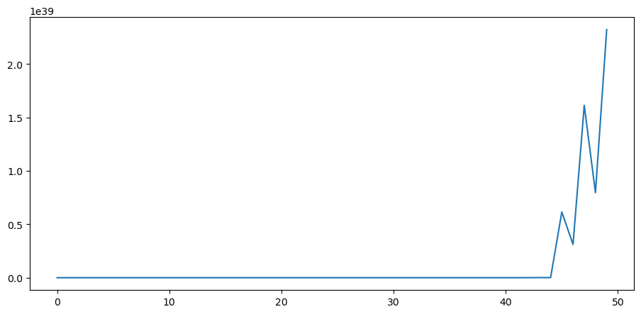
This in turn implies that the unconditional mean of the likelihood ratio process \(L(w^t)\) diverges toward \(+ \infty\).
Simulations below confirm this conclusion.
Please note the scale of the \(y\) axis.
l_arr_f = simulate(F_a, F_b, N=50000)
l_seq_f = np.cumprod(l_arr_f, axis=1)
N, T = l_arr_f.shape
plt.plot(range(T), np.mean(l_seq_f, axis=0))
[<matplotlib.lines.Line2D at 0x7f2e140331d0>]
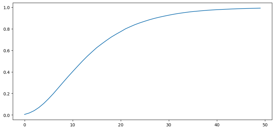
We also plot the probability that \(L\left(w^t\right)\) falls into the interval \([10000, \infty)\) as a function of time and watch how fast probability mass diverges to \(+\infty\).
plt.plot(range(T), np.sum(l_seq_f > 10000, axis=0) / N)
[<matplotlib.lines.Line2D at 0x7f2e13d88650>]
11.6. Likelihood Ratio Test#
We now describe how to employ the machinery of Neyman and Pearson [NP33] to test the hypothesis that history \(w^t\) is generated by repeated IID draws from density \(g\).
Denote \(q\) as the data generating process, so that \(q=f \text{ or } g\).
Upon observing a sample \(\{W_i\}_{i=1}^t\), we want to decide whether nature is drawing from \(g\) or from \(f\) by performing a (frequentist) hypothesis test.
We specify
Null hypothesis \(H_0\): \(q=f\),
Alternative hypothesis \(H_1\): \(q=g\).
Neyman and Pearson proved that the best way to test this hypothesis is to use a likelihood ratio test that takes the form:
reject \(H_0\) if \(L(W^t) < c\),
accept \(H_0\) otherwise.
where \(c\) is a given discrimination threshold, to be chosen in a way we’ll soon describe.
This test is best in the sense that it is a uniformly most powerful test.
To understand what this means, we have to define probabilities of two important events that allow us to characterize a test associated with a given threshold \(c\).
The two probabilities are:
Probability of detection (= power = 1 minus probability of Type II error):
\[ 1-\beta \equiv \Pr\left\{ L\left(w^{t}\right)<c\mid q=g\right\} \]Probability of false alarm (= significance level = probability of Type I error):
\[ \alpha \equiv \Pr\left\{ L\left(w^{t}\right)<c\mid q=f\right\} \]
The Neyman-Pearson Lemma states that among all possible tests, a likelihood ratio test maximizes the probability of detection for a given probability of false alarm.
Another way to say the same thing is that among all possible tests, a likelihood ratio test maximizes power for a given significance level.
To have made a good inference, we want a small probability of false alarm and a large probability of detection.
With sample size \(t\) fixed, we can change our two probabilities by adjusting \(c\).
A troublesome “that’s life” fact is that these two probabilities move in the same direction as we vary the critical value \(c\).
Without specifying quantitative losses from making Type I and Type II errors, there is little that we can say about how we should trade off probabilities of the two types of mistakes.
We do know that increasing sample size \(t\) improves statistical inference.
Below we plot some informative figures that illustrate this.
We also present a classical frequentist method for choosing a sample size \(t\).
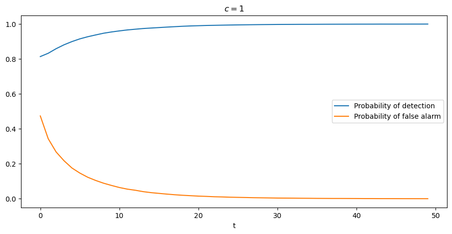
Let’s start with a case in which we fix the threshold \(c\) at \(1\).
c = 1
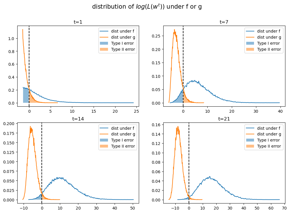
Below we plot empirical distributions of logarithms of the cumulative likelihood ratios simulated above, which are generated by either \(f\) or \(g\).
Taking logarithms has no effect on calculating the probabilities because the log is a monotonic transformation.
As \(t\) increases, the probabilities of making Type I and Type II errors both decrease, which is good.
This is because most of the probability mass of log\((L(w^t))\) moves toward \(-\infty\) when \(g\) is the data generating process, ; while log\((L(w^t))\) goes to \(\infty\) when data are generated by \(f\).
That disparate behavior of log\((L(w^t))\) under \(f\) and \(q\) is what makes it possible to distinguish \(q=f\) from \(q=g\).
fig, axs = plt.subplots(2, 2, figsize=(12, 8))
fig.suptitle('distribution of $log(L(w^t))$ under f or g', fontsize=15)

for i, t in enumerate([1, 7, 14, 21]):
    nr = i // 2
    nc = i % 2

    axs[nr, nc].axvline(np.log(c), color="k", ls="--")

    hist_f, x_f = np.histogram(np.log(l_seq_f[:, t]), 200, density=True)
    hist_g, x_g = np.histogram(np.log(l_seq_g[:, t]), 200, density=True)

    axs[nr, nc].plot(x_f[1:], hist_f, label="dist under f")
    axs[nr, nc].plot(x_g[1:], hist_g, label="dist under g")

    for i, (x, hist, label) in enumerate(zip([x_f, x_g], [hist_f, hist_g], ["Type I error", "Type II error"])):
        ind = x[1:] <= np.log(c) if i == 0 else x[1:] > np.log(c)
        axs[nr, nc].fill_between(x[1:][ind], hist[ind], alpha=0.5, label=label)

    axs[nr, nc].legend()
    axs[nr, nc].set_title(f"t={t}")

plt.show()
The graph below shows more clearly that, when we hold the threshold \(c\) fixed, the probability of detection monotonically increases with increases in \(t\) and that the probability of a false alarm monotonically decreases.
PD = np.empty(T)
PFA = np.empty(T)

for t in range(T):
    PD[t] = np.sum(l_seq_g[:, t] < c) / N
    PFA[t] = np.sum(l_seq_f[:, t] < c) / N

plt.plot(range(T), PD, label="Probability of detection")
plt.plot(range(T), PFA, label="Probability of false alarm")
plt.xlabel("t")
plt.title("$c=1$")
plt.legend()
plt.show()
For a given sample size \(t\), the threshold \(c\) uniquely pins down probabilities of both types of error.
If for a fixed \(t\) we now free up and move \(c\), we will sweep out the probability of detection as a function of the probability of false alarm.
This produces what is called a receiver operating characteristic curve.
Below, we plot receiver operating characteristic curves for different sample sizes \(t\).
PFA = np.arange(0, 100, 1)

for t in range(1, 15, 4):
    percentile = np.percentile(l_seq_f[:, t], PFA)
    PD = [np.sum(l_seq_g[:, t] < p) / N for p in percentile]

    plt.plot(PFA / 100, PD, label=f"t={t}")

plt.scatter(0, 1, label="perfect detection")
plt.plot([0, 1], [0, 1], color='k', ls='--', label="random detection")

plt.arrow(0.5, 0.5, -0.15, 0.15, head_width=0.03)
plt.text(0.35, 0.7, "better")
plt.xlabel("Probability of false alarm")
plt.ylabel("Probability of detection")
plt.legend()
plt.title("Receiver Operating Characteristic Curve")
plt.show()
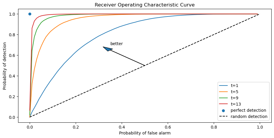
Notice that as \(t\) increases, we are assured a larger probability of detection and a smaller probability of false alarm associated with a given discrimination threshold \(c\).
As \(t \rightarrow + \infty\), we approach the perfect detection curve that is indicated by a right angle hinging on the blue dot.
For a given sample size \(t\), the discrimination threshold \(c\) determines a point on the receiver operating characteristic curve.
It is up to the test designer to trade off probabilities of making the two types of errors.
But we know how to choose the smallest sample size to achieve given targets for the probabilities.
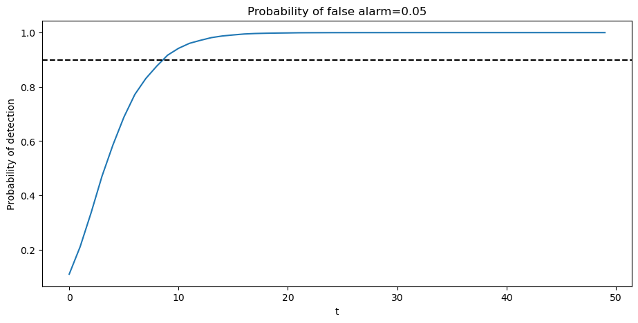
Typically, frequentists aim for a high probability of detection that respects an upper bound on the probability of false alarm.
Below we show an example in which we fix the probability of false alarm at \(0.05\).
The required sample size for making a decision is then determined by a target probability of detection, for example, \(0.9\), as depicted in the following graph.
PFA = 0.05
PD = np.empty(T)

for t in range(T):

    c = np.percentile(l_seq_f[:, t], PFA * 100)
    PD[t] = np.sum(l_seq_g[:, t] < c) / N

plt.plot(range(T), PD)
plt.axhline(0.9, color="k", ls="--")

plt.xlabel("t")
plt.ylabel("Probability of detection")
plt.title(f"Probability of false alarm={PFA}")
plt.show()
The United States Navy evidently used a procedure like this to select a sample size \(t\) for doing quality control tests during World War II.
A Navy Captain who had been ordered to perform tests of this kind had doubts about it that he presented to Milton Friedman, as we describe in this lecture.
11.7. Kullback–Leibler Divergence#
Now let’s consider a case in which neither \(g\) nor \(f\) generates the data.
Instead, a third distribution \(h\) does.
Let’s watch how how the cumulated likelihood ratios \(f/g\) behave when \(h\) governs the data.
A key tool here is called Kullback–Leibler divergence.
It is also called relative entropy.
It measures how one probability distribution differs from another.
In our application, we want to measure how \(f\) or \(g\) diverges from \(h\)
The two Kullback–Leibler divergences pertinent for us are \(K_f\) and \(K_g\) defined as
When \(K_g < K_f\), \(g\) is closer to \(h\) than \(f\) is.
In that case we’ll find that \(L\left(w^t\right) \rightarrow 0\).
When \(K_g > K_f\), \(f\) is closer to \(h\) than \(g\) is.
In that case we’ll find that \(L\left(w^t\right) \rightarrow + \infty\)
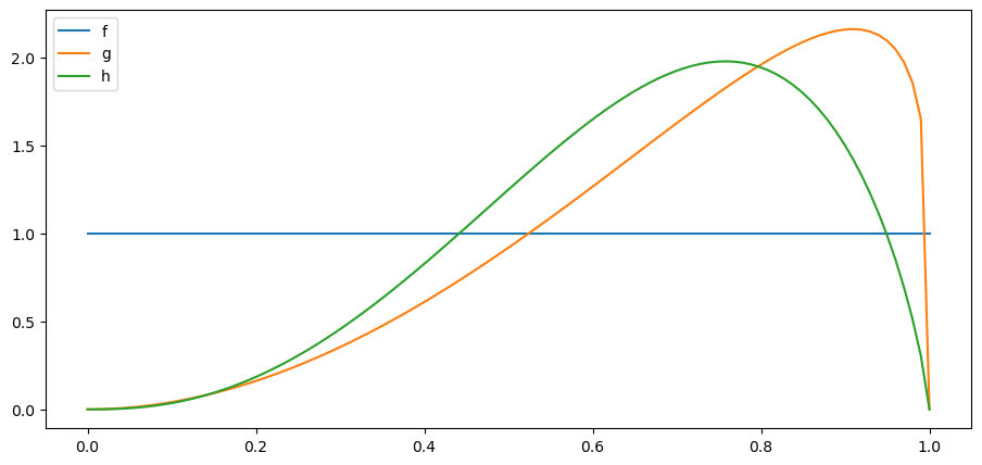
We’ll now experiment with an \(h\) is also a beta distribution
We’ll start by setting parameters \(G_a\) and \(G_b\) so that \(h\) is closer to \(g\)
H_a, H_b = 3.5, 1.8

h = njit(lambda x: p(x, H_a, H_b))
x_range = np.linspace(0, 1, 100)
plt.plot(x_range, f(x_range), label='f')
plt.plot(x_range, g(x_range), label='g')
plt.plot(x_range, h(x_range), label='h')

plt.legend()
plt.show()
Let’s compute the Kullback–Leibler discrepancies by quadrature integration.
def KL_integrand(w, q, h):

    m = q(w) / h(w)

    return np.log(m) * q(w)
def compute_KL(h, f, g):

    Kf, _ = quad(KL_integrand, 0, 1, args=(f, h))
    Kg, _ = quad(KL_integrand, 0, 1, args=(g, h))

    return Kf, Kg
Kf, Kg = compute_KL(h, f, g)
Kf, Kg
(0.7902536603660161, 0.08554075759988769)
We have \(K_g < K_f\).
Next, we can verify our conjecture about \(L\left(w^t\right)\) by simulation.
l_arr_h = simulate(H_a, H_b)
l_seq_h = np.cumprod(l_arr_h, axis=1)
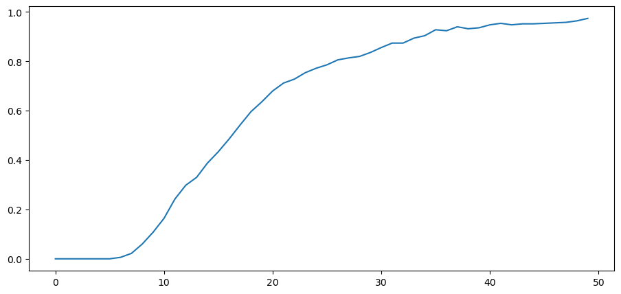
The figure below plots over time the fraction of paths \(L\left(w^t\right)\) that fall in the interval \([0,0.01]\).
Notice that it converges to 1 as expected when \(g\) is closer to \(h\) than \(f\) is.
N, T = l_arr_h.shape
plt.plot(range(T), np.sum(l_seq_h <= 0.01, axis=0) / N)
[<matplotlib.lines.Line2D at 0x7f2e13bbb1d0>]
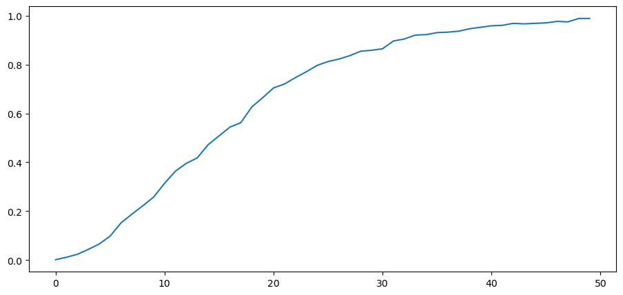
We can also try an \(h\) that is closer to \(f\) than is \(g\) so that now \(K_g\) is larger than \(K_f\).
H_a, H_b = 1.2, 1.2
h = njit(lambda x: p(x, H_a, H_b))
Kf, Kg = compute_KL(h, f, g)
Kf, Kg
(0.01239249754452668, 0.35377684280997646)
l_arr_h = simulate(H_a, H_b)
l_seq_h = np.cumprod(l_arr_h, axis=1)
Now probability mass of \(L\left(w^t\right)\) falling above \(10000\) diverges to \(+\infty\).
N, T = l_arr_h.shape
plt.plot(range(T), np.sum(l_seq_h > 10000, axis=0) / N)
[<matplotlib.lines.Line2D at 0x7f2e10116790>]
11.8. Sequels#
Likelihood processes play an important role in Bayesian learning, as described in this lecture and as applied in this lecture.
Likelihood ratio processes appear again in this lecture, which contains another illustration of the peculiar property of likelihood ratio processes described above.
